Component Libraries
For each Jesus Film project, Material UI is used to build the component library. mui is the latest web component library following the Material Design 2 design system.
UX refer to Material Design to understand usage guidelines whilst developers should refer to Material UI to understand how to build and style components.
Understanding the Component Hierarchy
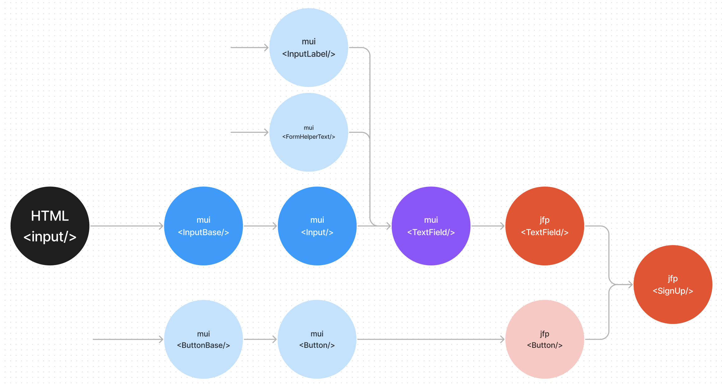
Each component is built from other components, as we move across the tree - the component styling and functionality becomes more specific.
Simplified Input example:

The HTML input can take on multiple types and attributes. Each successive input component uses a subset of these attributes and adds their own to create components for a narrower use case.
For example
Mui-InputBaseadds end adornment, hides allinput=checkboxattributes and includes minimal styling.Mui-TextFieldadd labels, validation and form control.
Compare and contrast properties on HTML input, Mui-InputBase and Mui-TextField to see more.
Mui components
Usually only the highest level mui components (eg TextField) are recommended for use. See full list here.
All Material UI components will be themed with the mui default theme.
Since we reuse these high level mui components to build many different components, these are known as common components.
Our components
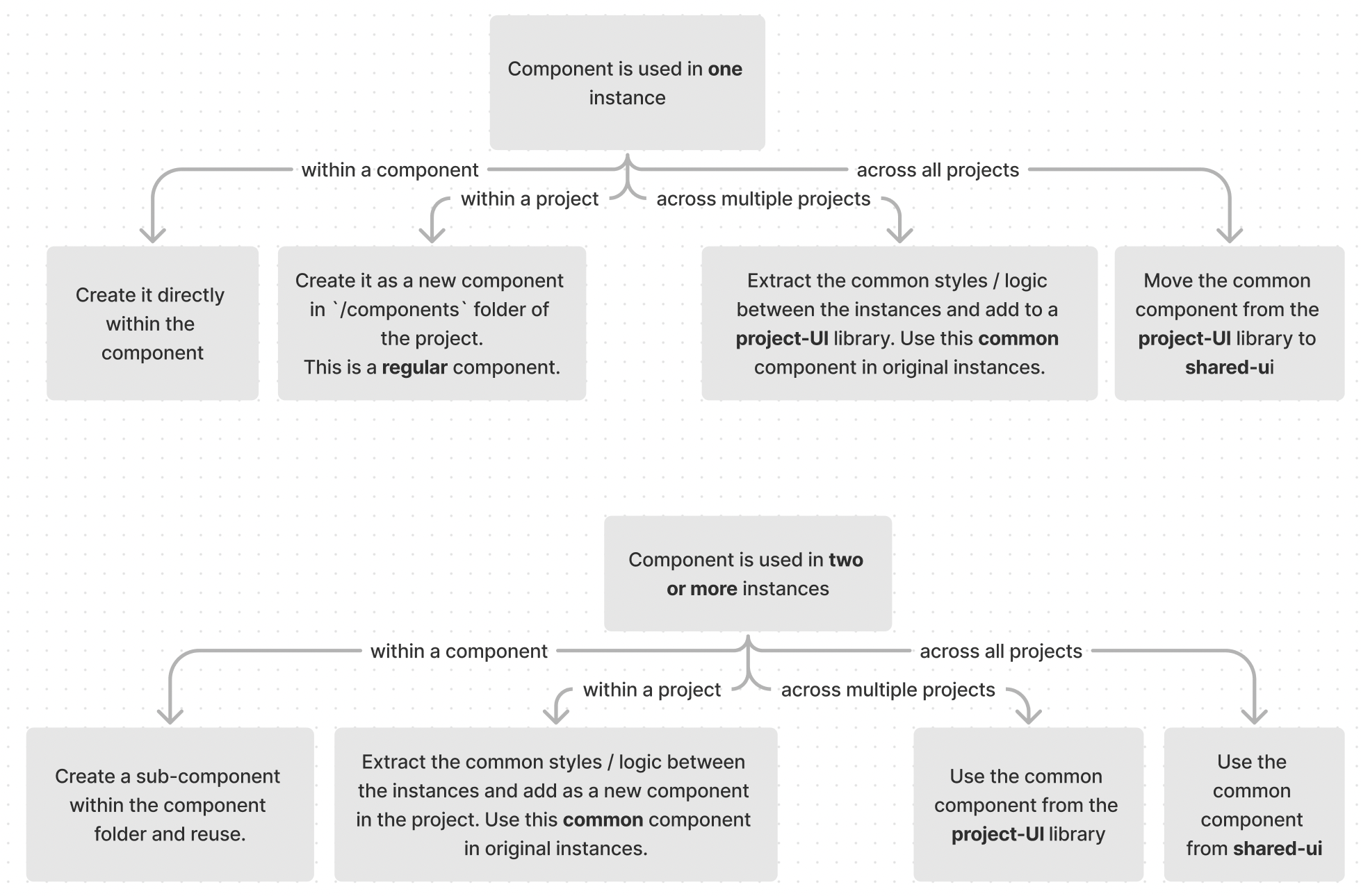
We need the Mui components to look and/or function differently to the default. We apply multiple different strategies for each use case.
For styling & function changes for all components, we override the mui default theme with different themes.
See more on project theming here.
For all other use cases:

This results in the following project structure:
Applications
- Contain application specific components
UI Libraries
- journey-ui: common components used in
journeys&journeys-admin - shared-ui: common components used in all app projects
Themes
- base: default theme for Next Steps. Includes project specific styles for journeys.
- website: project theme for Jesus Film Project websites
- admin: project theme for admin projects.
This common implementation pattern is derived from the Atomic Web Design approach
Component Types
In our monorepo we can categorize all the components we create into common and regular components, of which there are several types:
Common components
Any component intended for reuse in multiple different components. This includes:
-
Some unique component made from multiple components like
For example journeys-admin Button is made from Mui-Box, Mui-Typography and Mui-Stack amongst others.
-
An extension of a component.
For example journeys-ui TextField uses the
filledvariant of Mui-TextField and adapts it to work with formik - a form management library. -
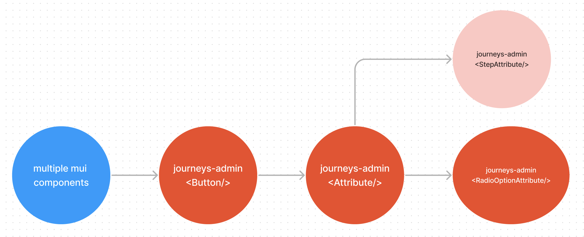
An instance of a component
For example Attribute is a version of journeys-admin Button which sets the
selectedandonClicklogic.
Regular components
Unique components only used in one other component / page. Similarly they are created by:
-
Unique components made from multiple components
See watch Header
-
Extending a component
See ShareDialog (extended from shared-ui Dialog)
-
An instance of a component
See RadioOptionAttribute (instance of Attribute)
Visual tests differ based on component type.
FAQs
Can I use whatever components I want as long as I make it look like the design?
No! Each component is designed for a different use case and will have accessibility labels and theming built in. Using arbitrary components just based on look can result in:
- Fundamental landmark roles being misapplied or not applied
- Poor user experience for those needing screen-readers or other assistive technology
- Styling of components breaking when we change our theme
- Adding unnecessary styling complexity to each component, increasing the maintenance burden
- Future updates to components risk breaking behaviour (especially for less stable common component libraries you may create or work with)
What if I need both the default mui component and a jfp component with the same name, in the same file?
Prepend Mui to the mui component and import like so:
import MuiTextField from '@mui/material/TextField'
import TextField from "../components/TextField'